Lesson 22: Game Art Style Categories
Last lesson: game art serves gameplay. Before you start, you still need to answer one question — what should your game look like?
That's art style. It's not just "pretty or not" — it's the game's visual identity.
1. Why Style Matters
Style ties into:
- Who will play: cute, hardcore, or nostalgic — first impression filters players
- Whether you can finish: pixel / minimal cartoon, one person can carry it; detailed hand-painted or high realism, cost explodes
- Where it's played: mobile needs clarity and battery efficiency; PC / console can push more complex visuals
- Whether it's memorable: the more unified and bold the simplification, the easier to recognize
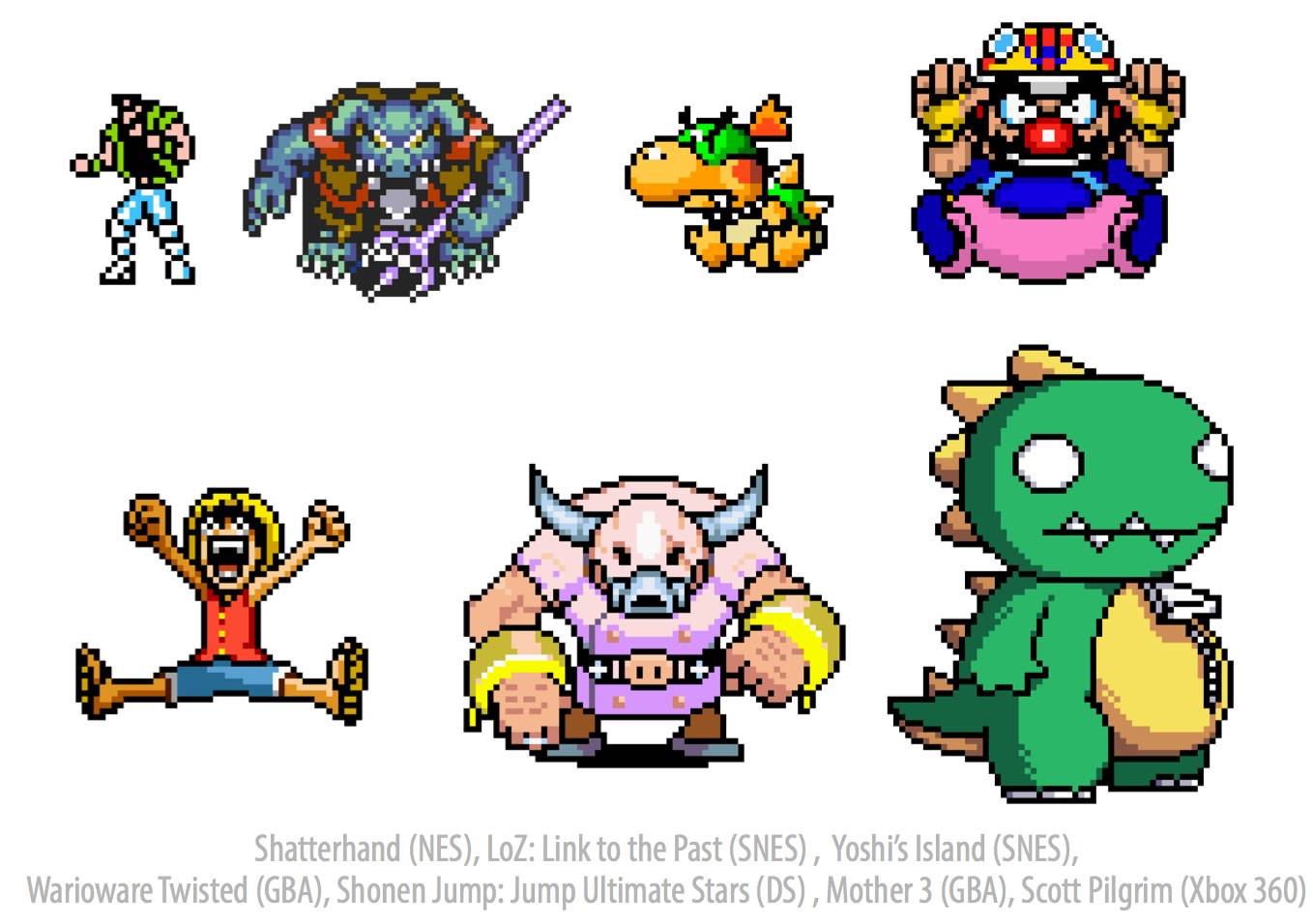
Within "pixel art" alone, differences are huge — see the image above: same character sprite, but outline weight, coloring approach, and detail density can span eras.
2. First Split: Realistic vs. Stylized
When choosing style, don't jump straight to "pixel or not." The bigger fork is:
| Realistic lean | Stylized lean | |
|---|---|---|
| Goal | Closer to reality / photographic | Deliberately exaggerated, simplified, rule-based |
| Cost | High (structure, materials, lighting are hard to fake) | High or low, depending how strict you are |
| Examples | Realistic 3D, semi-realistic pixel | Pixel, cartoon, low poly, paper cutout… |
For indie dev and this course: default to stylized. The pixel art you've practiced is already a strong style constraint.
Realism isn't "more advanced." Especially for pixel art: whether the body is slightly realistic depends on whether gameplay needs it — Enter the Gungeon's "body simplified into blocks" is fast and readable, not "worse."
3. Mainstream 2D (and Common) Styles at a Glance
3.1 Pixel Art
The path you know best.
- Low resolution, visible pixel blocks
- Limited palettes, colors must be reused
- Strong retro feel, one person can finish a small game
- Animation is often frame-by-frame hand-drawn; more detail = more time
Representative titles: Celeste, Stardew Valley, Dead Cells, Eastward
Pixel has many "sub-styles" too: outline or not, black vs. colored outline, selective outlining (selout), chibi vs. slightly realistic… Change the outline rules and the whole sprite's vibe shifts instantly.
Good for: indie dev, small teams, projects that want memorability through constraints.
3.2 Hand-drawn
No "pixel grid" limit — lines and materials are freer.
- Strong expression, atmosphere is easier
- Huge animation workload (many drawings per second)
- High bar for artist fundamentals
Examples: Hollow Knight, Ori, Cuphead (rubber-hose animation feel)
Pixel art can borrow hand-drawn rhythm: silhouette → keyframes → color. The difference is mainly — whether you allow yourself off the pixel grid for brushwork and texture.
Good for: teams with solid drawing / animation skills willing to invest time in mood.
3.3 Cartoon / Comic
Emphasizes outlines, flat color, exaggerated deformation.
- Bold outline + flat fill, fast recognition
- Big expressions and motion
- Efficient for series and character rosters
Examples: Castle Crashers, Don't Starve, Hades (portraits lean comic)
Good for: bright, readable, approachable projects.
3.4 Low Poly / Strong Geometry
Often 3D with few faces + flat shading; same family as "deliberately geometric."
- Modern feel, performance-friendly
- Silhouette and color blocks are the design
- Not opposed to pixel: many people go from "geometric reduction" back to pixel
Examples: Monument Valley, Superhot, Minecraft (voxel extreme)
Good for: teams wanting depth without realistic cost.
3.5 Isometric / ISO (Brief Note)
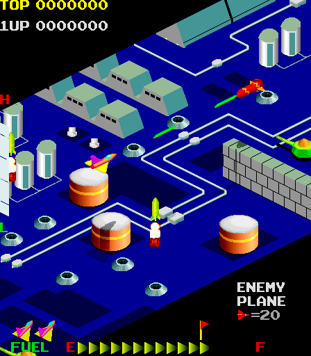
Angled "fake 3D" (no vanishing point). Arcade Zaxxon, many builders / sims, eboy-style scenes use this. It's not a "fourth skin" — more like camera angle + a perspective rule set. Once locked, building and character scale must follow; you can't mid-project swap to pure side view and mash pieces together.
Good for: builders, sims, projects wanting 3D-feel scenes without real 3D.
3.6 Paper / Collage
Layered paper sheets, clean edges, strong handmade feel.
Examples: Paper Mario series, Tearaway
Good for: projects chasing extreme recognition willing to pay for "special craft."
Knowing these main categories is enough. What you actually do is usually pick one (this course assumes you keep focusing on pixel), then write your rules in stone.
4. How to Choose: Four Questions
1. How many artists?
   1 person → pixel / minimal cartoon / geometric
   2+ → still pixel; cartoon can carry a bit more

2. Platform?
   Mobile → simple, clear outlines, less tiny detail
   PC/console → can be more complex, but don't complex for its own sake

3. Gameplay pace?
   Fast action → high contrast, clear silhouettes
   Puzzle/narrative → can stack atmosphere
   Multiplayer on one screen → characters must be highly distinguishable

4. What is the team best at?
   Prioritize strengths; don't chase whatever's hottest
Once chosen, don't flip every three days. Style whiplash is worse than "picking a slightly off style."
5. After Locking Style: Consistency Is Everything
Common indie failures:
- Character A is polished pixel; Character B looks like a different engine
- Retro pixel visuals but UI is random modern flat design pasted on
- Realistic scene scale but characters are big-head chibi (unless you planned "big portraits, small scene characters" from day one and execute consistently)
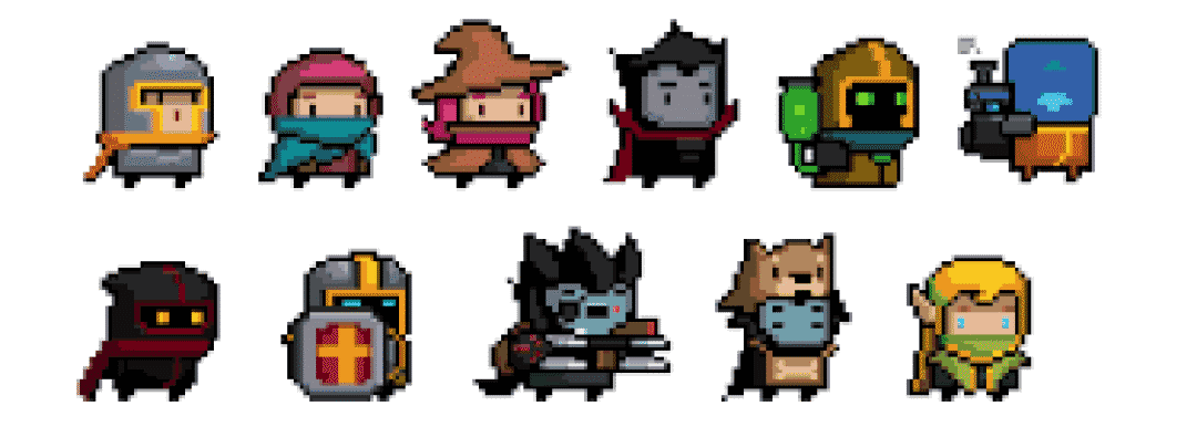
One cast sharing the same head-body ratio, outline, and value steps — players automatically read them as "residents of the same game."
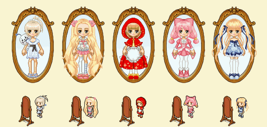
Big portraits and small walk sprites can stay consistent: different information density, but face shape, palette, silhouette keywords must match.
How to Stay Consistent?
1. One-page Style Guide is enough
At minimum specify:
- Palette: primary / secondary / accent (one reference image is best)
- Lines: outline or not? Black or colored? How thick?
- Proportions: head-body ratio; character vs. tile size
- Lighting: main light direction? Hard or soft shadows?
- Bans: e.g., "no new palette per image," "no skeuomorphic 3D buttons in UI"
2. Make 3 benchmark assets
- One standard character
- One standard environment block (or tile)
- One standard UI component
Everything else copies their rules.
3. Someone calls the shots
Solo project: you are the art director — self-check against the Style Guide before shipping. Team: designate one style gatekeeper.
6. Advanced Note: Recognition Comes from "One Rule"
Some works aren't the most detailed — the whole game repeats one visual rule.
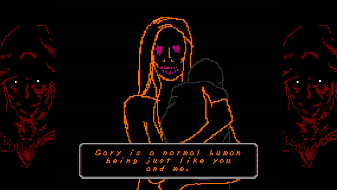
Ultra-low-res horror like FAITH: few colors, thick lines, and "deliberately unclear monsters" for dread — that's a design choice, not "lack of skill." You can set your own: four colors only, thick black borders everywhere, no gradients in scenes… then everyone obeys.
Pixel learners have an edge here: you've been drawing inside constraints already; a style guide is just writing those constraints on paper.
7. Homework
Collect 5 screenshots from different games (cover at least 3 major style categories, e.g., pixel / hand-drawn / cartoon / low poly / paper cutout). For each, write 3 lines:
- Style label (what you'd call it)
- Three traits (outline, palette, proportion, lighting… pick any)
- Suitable for solo dev? Why?
Optional bonus: write half a page Style Guide for your hypothetical game (palette + outline rules + head-body ratio + one "ban").
Next lesson goes technical: resolution and screen adaptation — style is set, but pixels still have to hold up on real screens.
课程作者:像素熊老师
微信公众号「教你画像素画」 · B站 · X / Twitter · GitHub