Lesson 24: Game Character Design Basics
Resolution handles "how big the canvas is." This lesson handles "what the person looks like."
From here we enter Phase Two: making real game assets. Characters first — what players see most and bond with easiest.
1. Three Pillars: Silhouette, Palette, Detail Layers
1.1 Silhouette
Silhouette = the outer shape when the character is filled solid black. It's the first gate for recognition.
In-game, characters are small, moving, and blocked by VFX. Players may have fractions of a second to decide "that's me / that's a monster." Silhouette does that job.
Good silhouettes usually:
- Distinct: don't merge into one shape among other characters
- Clear: limbs aren't glued into a blob
- Memorable: big hat, cape point, greatsword, long ears… one "spike" is enough
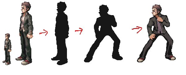
Practical workflow: when changing pose, edit the black blob silhouette first, confirm the gesture reads, then fill clothes back in. Don't start by polishing eye highlights.
Self-test: fill character pure black → shrink very small / step back → still recognizable? Can you tell friend from foe?
1.2 Palette
Color is an emotional calling card and the second recognition tool at small size.
Common ratio (don't memorize numbers — remember hierarchy):
| Layer | Role | Mario Example |
|---|---|---|
| Primary | First impression | Red |
| Secondary | Zones, depth | Blue overalls |
| Accent | Small highlights | Buttons / accessories |
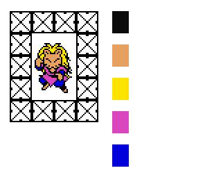
Pixel character palettes often need only a few colors: black outline + skin + hair + two clothing colors, and it works. More colors = easier to get muddy at small size.
Palette also serves readability (contrast thinking from Lesson 21): protagonist colors shouldn't blend into common ground or foliage.
1.3 Detail Layers (More Isn't Always Better)
| On-Screen Size | What Players See | What to Keep |
|---|---|---|
| Big portrait / dialogue box | Expression, small accessories | Can be detailed |
| Mid combat | Clothing color blocks, weapon outline | Clarity first |
| Distant / minimap | Silhouette + primary color | Recognition is enough |
Recommendation: start with the "smallest still readable" version (e.g., 16×16 or this lesson's homework size), add detail when larger. Piling detail then shrinking usually turns to mush.
2. Game Character ≠ Illustration Character
| Illustration Character | Game Character | |
|---|---|---|
| Goal | Beautiful, emotional | Readable, playable, animated |
| Pose | One pose is enough | Must animate continuously (at least Idle / Walk) |
| Proportions | Serve one image | Unified across the game (unless deliberate transform) |
| Detail | Easy to over-fill | Only what's needed; too many dots = hard to animate and read |
One line: must look good static and work in motion. Design thinking: can head, torso, arms, legs move separately? Where does the weapon attach?
3. Head-Body Ratio: Tied to Gameplay
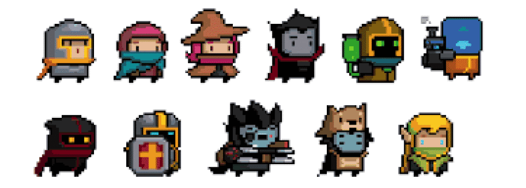
How realistic the body is doesn't depend on "advanced or not" — it depends on gameplay (Lesson 22 said this too):
| Lean | Rough Feel | Common Use |
|---|---|---|
| Ultra-simple body (block torso, short legs) | Minimal, animation-efficient | Bullet hell, fast shooters, small projects |
| 2–3 head-tall chibi | Big head, large expression area | RPG, management, cute tone |
| Slightly realistic | Clearer limbs | Action, stronger side-scroller impact |
| Monster / non-human | Break human rules freely | Enemies, bosses |
Side-scroller friendly for beginners: profile + chibi or semi-realistic, limbs easy to separate, walk animation approachable.
4. Set Size: Frame Before You Draw
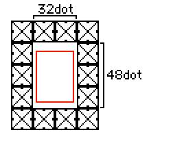
Lock canvas before drawing (connects to Lesson 23):
- Practice / many RPG walk sprites: common 32×48 height frame
- Smaller platform / minions: 16×16, 24×24
- Bigger = finer: expressions easier, animation cost rises too
Once chosen, don't sneak +8 pixels mid-project "just to look nicer" — whole enemy set, doors, and tile scale collapse together.
5. Hard Rules for Pixel Characters
Self-check while designing:
- Separable parts: head / clothes / skin / legs split by color or gap, not one same-color blob
- Signature item: hat, hairstyle, weapon, cape — recognition at small size
- Animation-friendly: arms and legs leave room to move in idle pose; plan weapon arc
- Mirror left-right when you can: common in side-scrollers; top-down eight-direction saves half later (animation lessons expand)
- Same style as environment: outline rules and palette match your Lesson 22 Style Guide
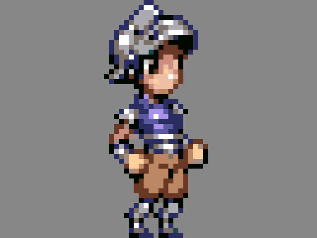
When you finish one "side idle," ask: silhouette still there? Primary color popping? Legs and arms movable separately?
6. Character Mini Doc (Enough Is Enough)
Solo project doesn't need a AAA art bible. Half a page:
Name:
Role: (protagonist / melee / mage…)
Three-sentence first impression:
Head-body ratio / canvas size:
Primary / secondary / accent:
Signature element: (hat? weapon?)
Directions needed: (side-scroller L/R / top-down four-way…)
Orthographic views: front, side, back — neutral standing pose each, height aligned.
Solo + side-scroller first: side view walkable and fightable first, front/back later — but homework still recommends all three views so you don't only draw "one cool pose."
Idle / Walk / Run frame sheets and keyframes come in later animation lessons; this lesson only ensures the design can move.
7. Homework
Design a game-ready pixel character and submit:
- Half-page brief: name, role, three-sentence impression, primary/secondary/accent, one signature item
- Silhouette test: character filled black + still readable when shrunk (before/after comparison OK)
- Three views: front / side / back, same size (recommend 32×32 or 32×48 class), proportions aligned
- Animation-friendly labels: on one sheet mark head, torso, arms, legs, weapon attach point
Optional: side Idle 2–4 frame breathing loop (must loop back to frame one).
Next lesson: environments and backgrounds — character exists; now give it a world to stand and play in.
课程作者:像素熊老师
微信公众号「教你画像素画」 · B站 · X / Twitter · GitHub