Lesson 27: Game UI Design Basics
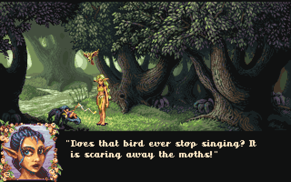
Item icons are done — they still need slots, dialogue boxes, and health bars. That's UI (User Interface).
Good UI is like air: players barely notice it, yet always know "how much HP, where to tap, what the NPC said." Bad UI blocks controls, blocks the picture, fonts turn to mush.
Pixel games are especially tight on space: base resolution is already small, so less, precise, consistent beats "fancy borders."
1. UI Splits into Three Blocks
HUD (always on during play)
| Element | Common Position |
|---|---|
| HP / MP bars | Top-left or near character |
| Hotbar / skills | Bottom |
| Minimap | Top-right |
| Quest hints | Side |
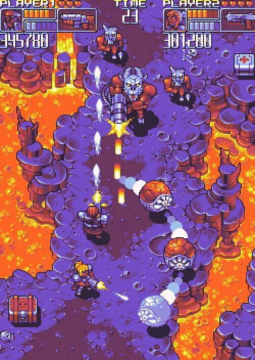
A top bar like this — time, both portraits, hearts, resource bars — all HUD. Info must read fast; don't cover where bullets fly.
Menus
Main menu, pause, inventory, shop, settings… usually full screen or overlay; can be slightly more complex.
Dialogue / prompts
NPC lines, item obtained, confirm quit. Like the opening image: bottom panel + portrait + text, game view still visible.
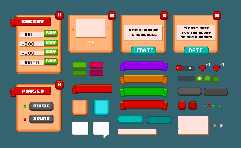
Small project: prep one set of "parts" — panel, close button, primary button, secondary button, heart HP, arrow… unified style, assemble into each screen.
2. Four Principles (Enough)
- Clear — icon + color (text when needed); red HP blue MP, don't swap
- Consistent — same function, same style; confirm/cancel positions don't change every level
- Feedback — hover highlight, press depress, hurt bar animates, cooldown icon grays out
- Don't block the action — center for gameplay; panels that only appear on input shouldn't stay lit
Pixel-specific: little space → hide secondary info by default; semi-transparent panels OK, but text contrast can't drop.
3. Pixel UI Drawing Notes
- Dark fill + light edge / light text, or wood/metal frame — pick one matching art style (Lesson 22 Style Guide)
- Text vs. background contrast must hold; on busy scenes don't drop raw text — panel underneath first
- Pixel fonts use Nearest; font size at integer multiples of native height (same rule as Lesson 23)
- Borders stay thin (1–2 px); decoration for important windows; daily buttons stay clean
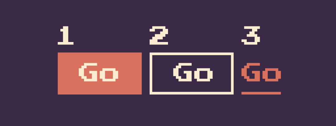
Button forms can vary: filled block, outline, text underline only — in one game pick one or two main styles; don't use three different ones once each.
4. Buttons Need "States"
At minimum these:
| State | Visual |
|---|---|
| Default | Normal color |
| Hover | Brighter / stronger outline |
| Pressed | Sinks down or light/dark swap |
| Disabled | Desaturated, semi-transparent |
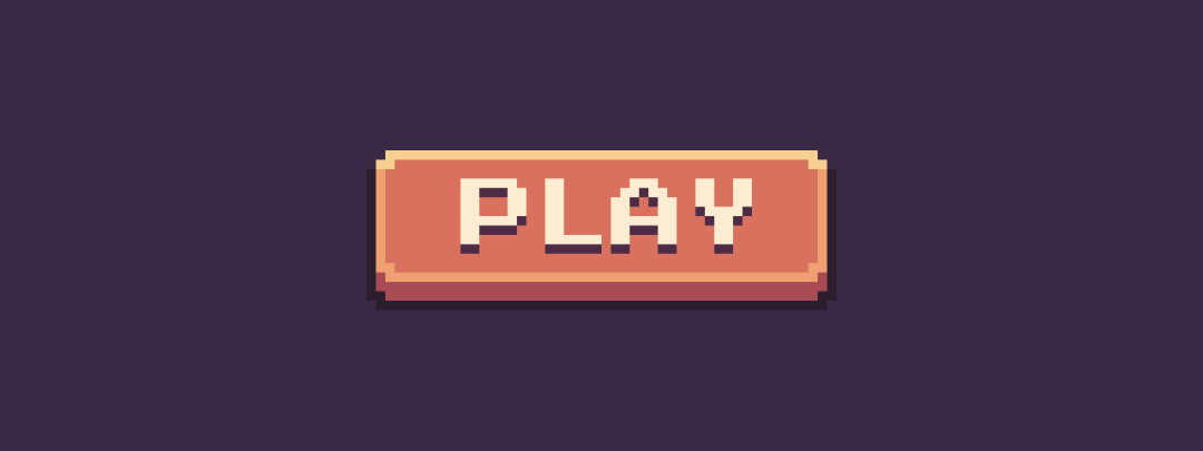
Pixel "raised" feel: bright top/left edge + dark bottom/right; reverse when pressed. Text can get 1 px shadow so it doesn't melt into fill.
5. Nine-slice (9-slice): Frames Scale Without Broken Corners
Dialogue boxes, inventory backs, long buttons often stretch. Hard-stretch whole image → 1 px edges thicken, corners squash.
Nine-slice cuts image into 9 pieces:
Corner fixed | top/bottom edge stretch horizontal | corner fixed
Left/right edge stretch vertical | center stretches both ways | …
Corner fixed | top/bottom edge stretch horizontal | corner fixed
Four corners don't stretch; four edges stretch one direction; center fills content.
In engines:
- Godot:
NinePatchRect, set Patch Margin - Unity: Sprite Border + Image Type = Sliced
When drawing assets: make one small complete frame (e.g., 24×24), corner decor on edges, center empty for stretch.
6. Health Bar and Layout (HUD Minimum Set)
Health bar common layers:
- Outer frame
- Empty slot fill
- Current value fill (can shorten)
- Optional: delayed white bar, numbers
80/100
HP loss: slide or delayed bar, not instant jump; low HP can flash.
Layout self-test:
[HP/MP ……]              [minimap]
           playable area
[skill slots]           [items]
Drop Lesson 26's 32× icons into skill slots; composite on real scene — block jump landing? Text blurry?
7. Homework
Make pixel UI that assembles into a minimal HUD:
- Layout sketch: mark health bar, hotbar (4 slots), dialogue box positions
- Assets:
- Health bar frame + fill bar
- 4 skill/item slots (can use Lesson 26 icons)
- Dialogue border (nine-slice thinking, corners intact)
- Button: same button in default / hover / pressed / disabled (recommend ~48×24)
- One mockup: overlay on game screen or Lesson 25 scene; check occlusion and readability
Optional: import dialogue frame into engine, stretch to two sizes, screenshot proving corners didn't deform.
Next lesson: VFX — hit flash, sparks, impact feel — UI tells you "how much HP left," VFX tells you "did that hit land."
课程作者:像素熊老师
微信公众号「教你画像素画」 · B站 · X / Twitter · GitHub