Lesson 12: Pixel Art Colors
1. The Importance of Color
To learn pixel art, you first need to be able to draw accurate shapes (you can use the double-reference method for this), and secondly, choose the right colors.
A common mistake for beginners is being unable to select the correct colors.
Choosing suitable colors and using the correct hues is very important for the success of a pixel art piece.
First, you may not know about the color wheel and saturation (the intensity of a color).

The color wheel has warm and cool colors. Oranges, reds, and yellows are warm, while blues, greens, and purples are cool.
When creating shadows in a piece, it is best to use colors that lean toward the cool side. For the brightest areas, it is obviously better to include more warm tones.
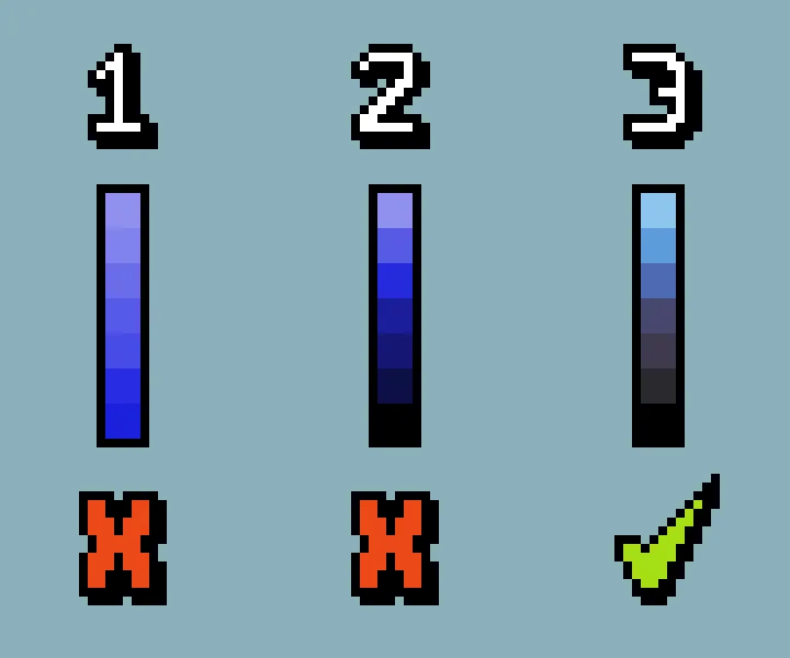
Many beginners will pick one color and then lighten or darken it to simulate light and shadow.
You should use analogous and complementary colors on the color wheel more often, rather than using just a single color for the entire piece.
Another common mistake beginners make when choosing colors is not creating strong enough contrast.
For low-resolution pixel art, the hue must be immediately recognizable.
2. Using Ready-Made Color Palettes
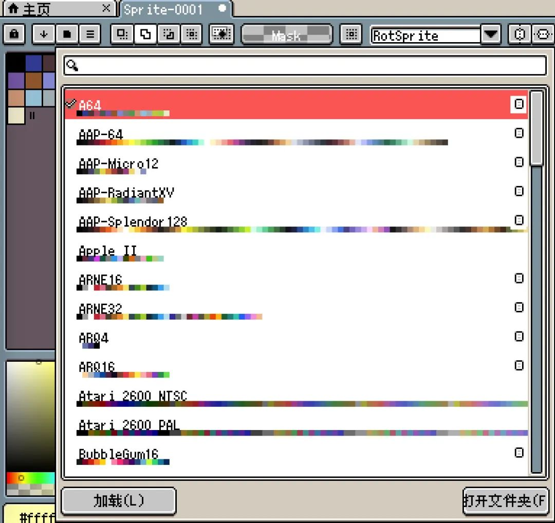
Aseprite comes with many built-in color palettes.
You can use these palettes directly to draw pixel art.
Colors are not copyrighted.
The first step in learning pixel art is to learn to draw accurate shapes, so you can draw any shape you want. The copyright for these shapes you draw belongs to you.
A good pixel art color palette has colors that "echo" each other. Starting from a base color, then deriving shadows and highlights through subtle adjustments.
When choosing a dark shade, don't just lower the brightness. Try moving the slider slightly toward blue or purple, and the shadow will instantly gain a sense of "translucency."
3. Color Basics
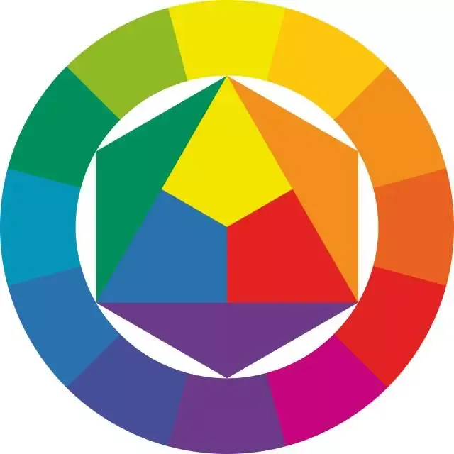
Arranging colors in a circle forms the color wheel. The purpose of the color wheel is to help you understand how colors are arranged and how they relate to one another.
The basics of color are the seven colors: red, orange, yellow, green, cyan, blue, and purple.
In most drawing software, red is on the far left and purple is on the far right.
The triangle in the middle of the color wheel represents the three primary colors: red, yellow, and blue.
Outside the triangle are the mixed colors. For example, orange = yellow + red.
So as long as you remember red, yellow, and blue, plus the colors mixed from them—orange, green, and purple—you have basically memorized most of the inherent colors.
4. Homework
Choose a built-in Aseprite color palette, replace the colors in one of your previous pixel art pieces with it, and then compare the results.
课程作者:像素熊老师
微信公众号「教你画像素画」 · B站 · X / Twitter · GitHub