Lesson 15: Pixel Art Color Usage Tutorial
1. Minimalism
Pixel art is a digital illustration style that insists on minimalism for both shape and color.
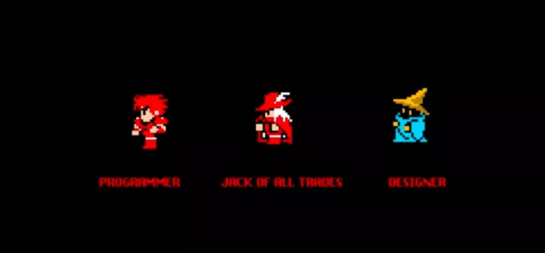
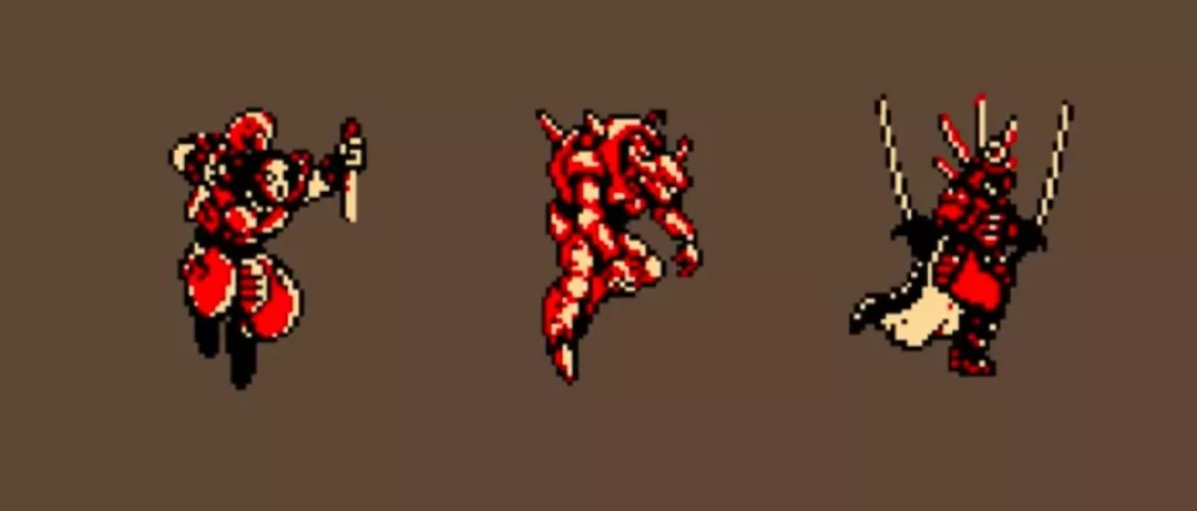
In early pixel art games, the vast majority of characters were completed using only 3 colors. Such characters have very high readability and recognizability.
Using more colors in pixel art does not mean higher skill level.
Without sufficient color control ability (which requires years of experience to accumulate and cannot be learned in a short time), more colors (if poorly matched or improperly used) will only make the character ugly and reduce readability.
But pixel art is exactly the opposite: with the same level of detail, fewer colors produce better results.
2. HSV Color Mode
Don't worry about not having enough colors. With just 3 colors, you can still design large-sized characters with equally rich details.
For learning pixel art, the HSV color mode is recommended because it is a very simple and direct way to manipulate color.
Color has 3 attributes:
- Hue (H): The type of color, that is, the 7 basic categories: red, orange, yellow, green, cyan, blue, and purple.
Colors inherently have brightness; blue and purple are darker than yellow. When actually painting, you need to make appropriate compensation based on the visual effect of the image.
- Saturation (S): The purity of a color. Mixing other colors into a color will reduce its purity.
Saturation is the intensity of a color. Bright red has high saturation, while gray has very low saturation. Generally, overly high saturation can be harmful to the eyes, so try to avoid using 100% saturated colors.
Large areas of highly saturated colors cause eye fatigue. Please use small areas of highly saturated colors as much as possible.
- Brightness (V): White is the brightest, and black is the darkest.
Brightness is the amount of light in a color. Light orange has high brightness, while dark orange has low brightness. This is usually directly related to light; areas with light have high color brightness, while shadow areas are the opposite.
Pitfall guide: Do not use colors with 100% saturation and 100% brightness directly, as that will make the image look like cheap plastic.
3. How to Choose Colors?
When dealing with light and shadow, choosing colors is especially important. Now let's focus on how to select colors when coloring.
When painting highlights, beginners will increase the brightness of the color, but the real world doesn't work this way.
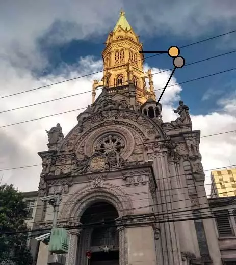
Look at this photo of a church. You can see that the bright area at the top is more saturated and leans toward yellow, while the dark area leans toward red.
Observing and analyzing photos or other excellent pixel art works is a great way to understand color and light.
Apply the observed light and dark changes to your work. Making both the highlight and shadow colors have a color bias will produce better results.
4. Canvas Background Color
It is recommended to use medium gray as the canvas background color.
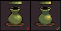
For example, in the image below, the yellow square in the center of the Rubik's cube on the left appears brighter to the eye than the yellow square on the right.
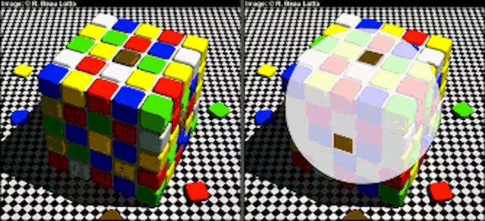
This is because the eye is affected by the dark colors surrounding the yellow square. In fact, the color values of the yellow squares are the same; what changes are the colors around them.
Because the colors perceived by the eye are influenced by the surrounding environmental colors, it is best to use medium gray as the background color when drawing pixel art, rather than white. Using a white background will cause colors to appear too bright.
5. Object Inherent Colors
Humans invented language and writing to communicate with each other. Color is also a tool for communication. People from different nations and countries perceive and feel differently about colors.
For example, Chinese people like red, which represents joy and good fortune, and dislike black and white, which represent death; while Westerners dislike red, which represents blood and the flames of hell, and prefer white, which represents holiness and purity.
Specifically, this means using colors that everyone in reality recognizes and can identify. For example, oranges are orange, and bananas are yellow. Pixel art beginners can also draw these common things in life, and every step in the process can be used in more complex works later.
Open your favorite pixel art reference image, use the eyedropper to pick colors, and observe the position of the colors in the color picker window.
Dragging the small square on the hue bar can change the hue of the color. For example, if you want to choose green, drag the small square to the green area of the hue bar. Of course, there are many, many kinds of green, and the subtle differences require some practice to master. For example, common pigment greens include: grass green, medium green, emerald green, olive green, dark green, etc.
Through observation, you can find that most inherent colors are in the upper-right area of the color picker. Highlight colors mostly lean toward the upper-left. Shadow colors lean toward the bottom.
6. Light and Dark Gradient Color Selection
Similarly, by studying the light and dark color selection patterns of excellent pixel art works, you can understand how to choose gradient colors. Use the eyedropper to pick colors from highlight to darkest in order, and arrange them by brightness. When picking, pay attention to 2 points: the position of the color in the color picker window, and the position of the color on the hue bar.
If you already have an inherent color, you can mix highlight and shadow colors separately according to the light and dark gradient rules. For pixel art, a minimum of 3 colors can be used to express the three-dimensionality of an object.
7. 16-Color Pixel Art
Since the background color takes up 1 color, you have 15 colors available.
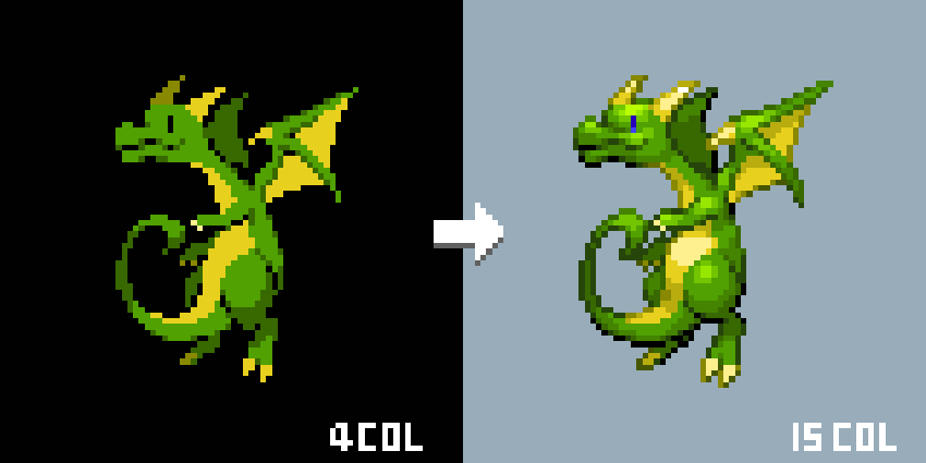
6 colors are the commonly used number of colors for home consoles such as Super Nintendo, Argoned Game, and Portable Game Machine. More colors and larger sizes mean more details. It doesn't mean you have to use all 15 colors; you can decide how many colors to use based on the actual style needed.
8. Homework
Choose a pixel art work with fewer than 16 colors and increase the colors to 16.
Note: Every new color added must have corresponding details.
课程作者:像素熊老师
微信公众号「教你画像素画」 · B站 · X / Twitter · GitHub